What is the combination of purple in the interior
It is not so easy to use purple color correctly in the interior. It is very active and bright, so you need to choose not only suitable colors, but also be careful with tones and even textures.
The content of the article
Purple color and its shades
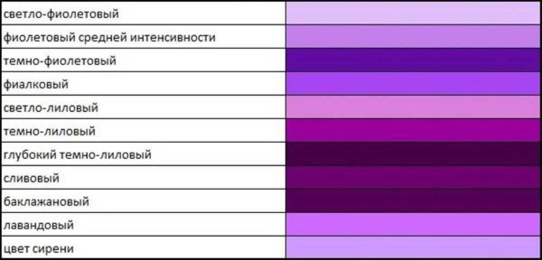
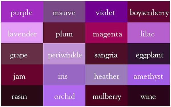
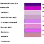
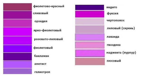
Purple is obtained by mixing red and blue. Depending on the predominance of this or that color, we get different shades - either warm or cold. In the palette of lilac shades there are such popular colors: lilac, purple, blackberry, eggplant, indigo, amethyst, fuchsia, lavender and more than a dozen others. Even if you decide to make a monochrome design - only in purple tones - it will not be boring, as there are many different shades that complement each other well.
-
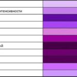
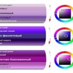
- Basic shades of purple
-
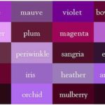
- The name of the shades of purple in English
-
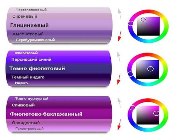
- Friendly shades by scale
-

- Shades of violet of varying degrees of "dilution"
-
- Light shades of violet colors
Pure violet is bright and intense. He brings notes of grace, wealth, stability. But using it in the interior as the main one is too risky an idea. The situation is too "difficult". Stylish, graceful, but ... you want to run fast and far.
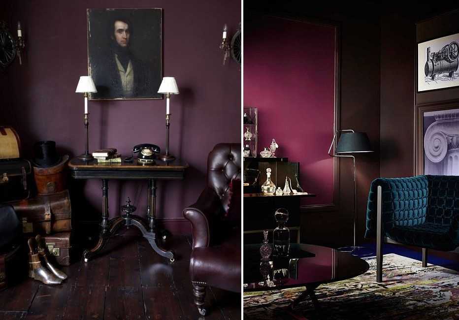
Purple color in the interior: stylish, solid, but ... You have to try very hard to stay in such a room
This does not mean that purple should not be used in the interior. If you like it, it's worth it. You just need special techniques, dosed use of bright, saturated colors, give more preference to light or pastel tones and shades.
Nice, but not for standard apartments and not for cloudy weather
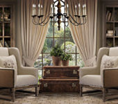
The main rule is that you should be careful with dark and saturated shades, they look too gloomy in our latitudes. Few regions of our country can boast of an abundance of sunny days “not in summer”. Saturated purple or lilac - too gloomy for cloudy weather. In addition, for standard apartments with low flows and not too spacious rooms, they are too pretentious. So you will have to choose, most likely, from light, pastel or, perhaps, bright.
What colors are combined with
White, black and gray - these colors are beyond competition, as they are compatible with any color. This is a base you can't go wrong with. In the violet range there is such a shade - purple. It has more red in it, so other shades are combined with it. The most successful combinations of purple with other colors are as follows:
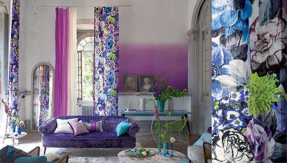
- Red and blue... May be present together or separately. It is better to combine purple in the interior with raspberry and coral and other pure reds. Blue should be muted or light. Magenta wins next to hot pink and fuchsia, muted shades of red, but blue should be "pure". Not necessarily bright, but without a touch of gray.
Red, blue, turquoise - they all look great as accents and more
- Green... Of the green colors, purple turquoise and its shades, the color of the sea wave, are best combined. Purple is combined with malachite, olive, green apple.
- Yellow... Purple is best combined with pure yellow (egg yolk), other pure tones are also suitable. It benefits from combinations with the color of gold, copper, brass. For purple, it is better to choose ocher - yellow-orange tones.
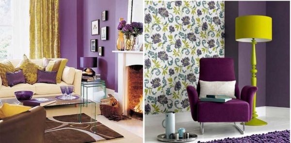
Yellow with purple is a winning combination
- Beige... It is best to add sand and cream. They perfectly highlight and slightly "muffle" the dominant purple.

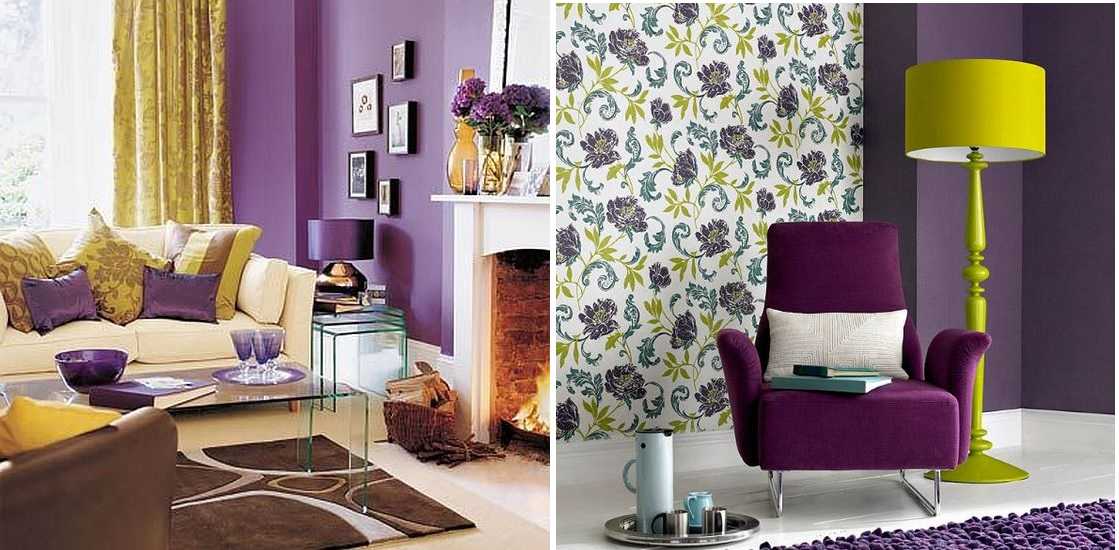
If we talk about combining with wood, then rocks of warm - yellowish and orange - tones will look great. Oak in natural color and dark shades such as bog oak, wenge, etc. are also suitable. The texture and color of wood will balance even bright, active tones. If there is more than one of them, they will not be too flashy. So purple is very appropriate in rooms with wood trim.
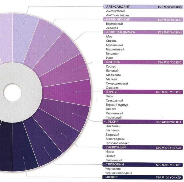
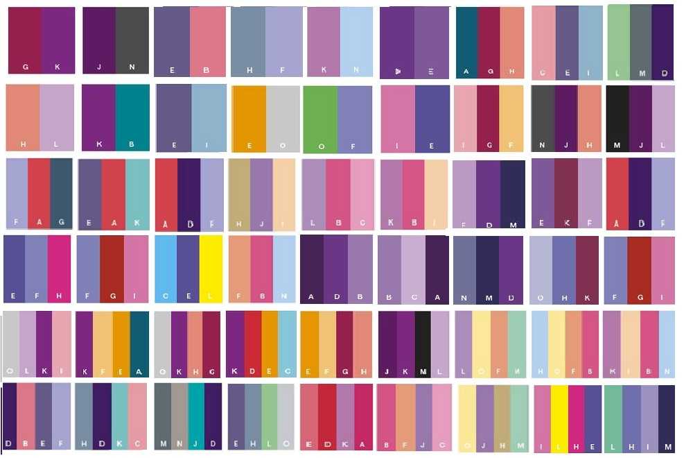
Tables of compatible colors with purple
All of the above is clearly illustrated by color matching tables. They allow you to visually assess what awaits you when decorating an interior using this combination. In such tables, there are combinations of two, three and four colors. They can be friendly (located next to the spectrum), contrasting (at opposite ends of the color wheel), or they can simply be different shades of the same color.
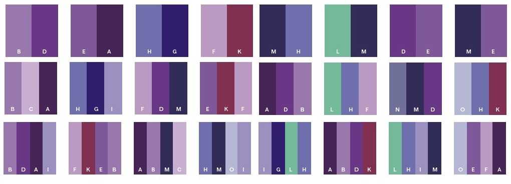
Classic combinations of purple with other colors
For an independent interior design, it is better not to take more than three shades. This does not mean that only they should be present in the design. Basic ones are added to them in any quantity - white, black, gray, wood.
White and "wooden" are inevitable and they are almost always present. These are the floor and ceiling, window frames and some other elements of decor and decoration. Gray and black are not found in all interiors, but they are also frequent guests. So even if you choose a double composition from the table, "in real life" you will get four or six colors. More than enough for one interior. Even more - and there will be a motley mess.
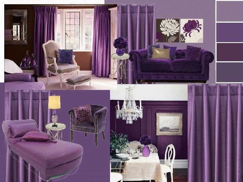
If you want something brighter, but with purple
If the created interior seems too restrained to you, you can easily refresh it with a couple of bright details that can be easily changed: pillows, curtains, paintings, vases, and other little things. It is these "little things" that give life and sound to the design. And with their help it is easy to change the "mood" of the room.
Terms of use
Purple can be used in the interior of premises for any purpose: in the living room, bedroom (adult and children's), in the kitchen, in the bathroom. Generally speaking, it is desirable to supplement it with shimmering textures, alternate satin, glossy, matte surfaces. It is very well set off with a metallic sheen, mirrors and bright, but "warm" lamp light.
What should be a lot in a purple interior is light. Warm lighting favorably sets off deep tones and enhances the color of "diluted" shades.
-
- Purple color in the bedroom of minimalism style
-
- Art Deco is also friendly with this range.

-
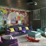
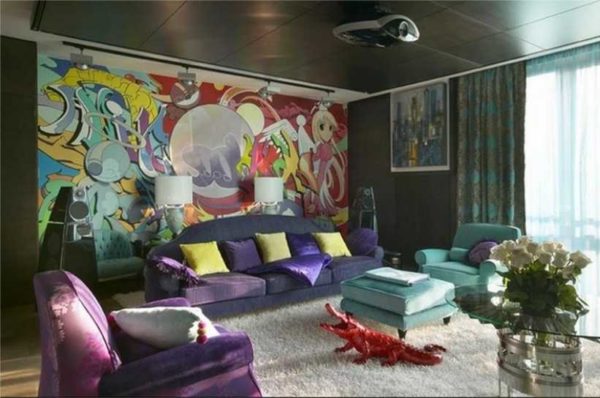
- Pop art and purple in several shades as complementary colors (combined with yellow and turquoise)
-

- High-tech bedroom in lilac tones

-
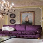
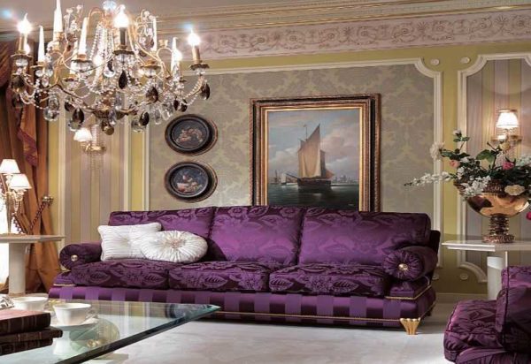
- Gold and purple color - a classic combination in a classic interior
-
- Provence and lilac or lilac tones. This combination can be seen in almost any interior of this style.
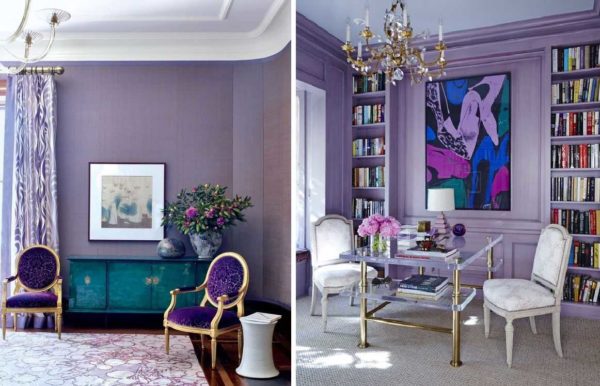
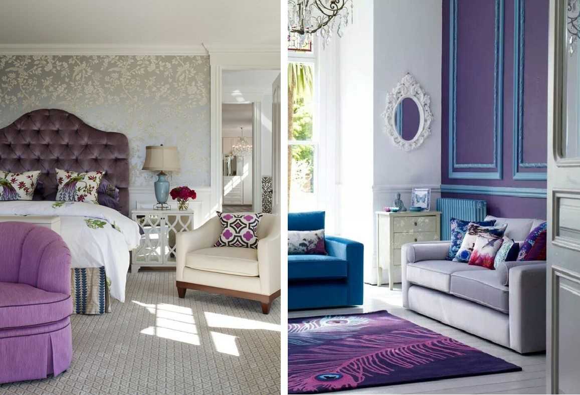
This is a very versatile color. It is appropriate in a classic interior (matte surfaces, calm shades), ethnic - like "Provence" - light, pastel colors, in modern and fashionable interiors such as high-tech, pop art, art deco, minimalism (bright colors, shiny surfaces ). Here is such a universal color. But designers use it carefully: it is too picky about combinations and materials. It is necessary to accurately and accurately select not only colors, but also the degree of brightness and surface texture.
As the main color of the interior
If you are very fond of purple and want to use it as the main color, it is better to choose light or pastel shades. Saturated and bright as the main ones are too “heavy”.As additional or accent, they are ideal, but in large quantities they are too "crushing" and oppressive. Dark shades can of course be diluted with yellow and softened with woodwork. The interior will be stable and solid, but it will still be somewhat "heavy".
Even in bright light it turns out gloomy ... but in cloudy autumn ...
Lighter ones - light purple, wisteria, salmon - diluted with white paint - do not give such an effect. Pastels (muted with gray) also do not “load” the space so much. Here they are good as the main color.

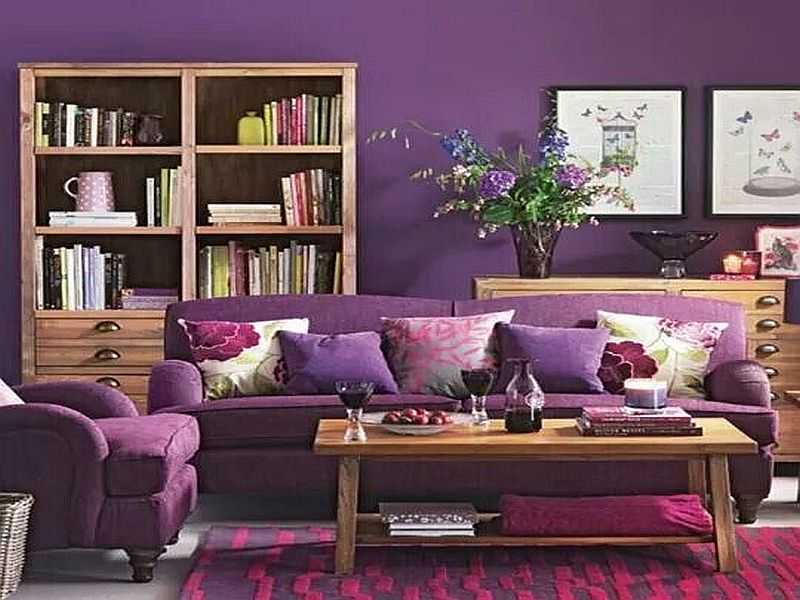
In the living room can be used as the main (for walls, textiles, etc.) purple or pastel light shades
Depending on the combination chosen, the design can be different in mood: from calm and restrained to mischievous and bright. It depends on the selected component colors. If you complement the interior with calm gray, beige, white, you get a restrained interior. Not cold, but restrained. With bright accents (and there are a lot of such combinations, much more than calm ones), a "warm" and active atmosphere is obtained. In the nursery or in the kitchen, even in the living room, this is very good, but this option is not suitable for the bedroom. Although, if you need energy, then why not.
As additional
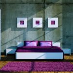
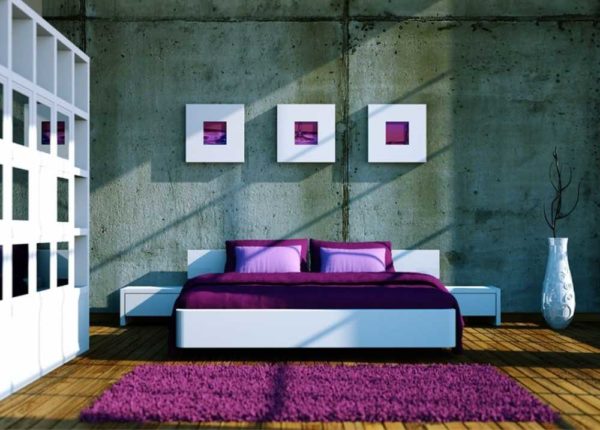
A popular interior decoration technique today is an accent wall. For these purposes, purple is what you need. Bright, self-sufficient, he himself does not remain out of the spotlight, and emphasizes the dignity of the main color. This technique is used in bedrooms, living rooms, kitchens. Practically in any residential or technical area of an apartment or house. Such a design in the hallway and corridor is questionable - they are usually too small in area and "load" them is not the best solution.

Accent purple wall in the bedroom. Reception is one, but because of the different accompanying colors, the "mood" of the interior is different
As an additional one, lilac and its shades can be used in furniture upholstery, curtains, carpets. This is a great way to liven up a room that was originally designed in white, beige or gray.
Add lilac accents for "liveliness"
Add a couple of bright pillows and other small details of turquoise or not too bright red to a purple, lilac sofa or bench, and the interior will be aristocratic, stylish, but at the same time, clearly not boring. If you add more and yellow, it will turn out even more joyful and bright. It doesn't look like aristocratic restraint, but the expressiveness and originality of the inhabitants is clearly felt.
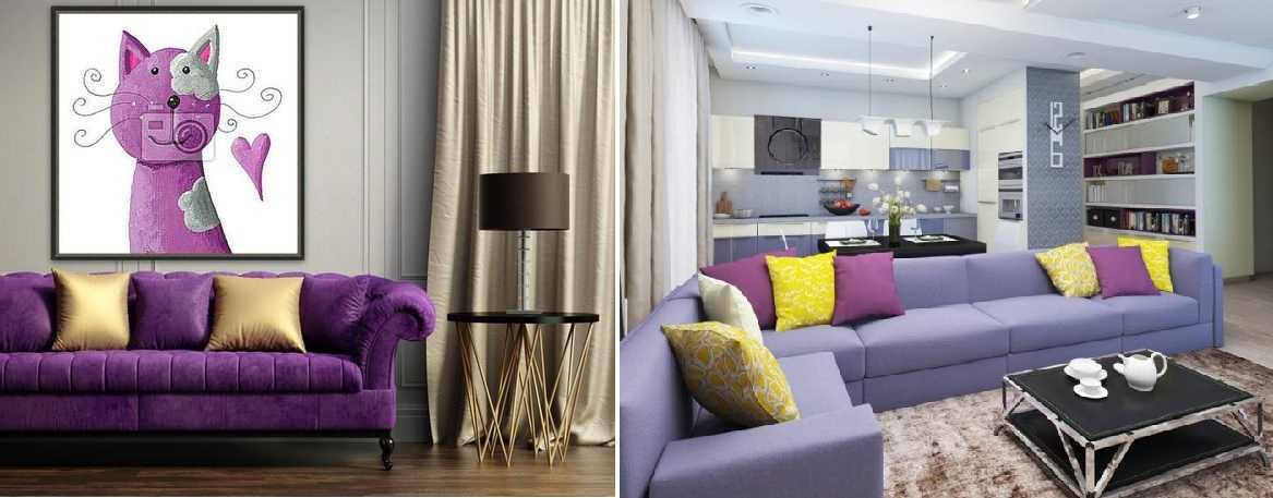
More cheerful with yellow details
Moreover, as you can see, this technique works both with rich violet, and with not too bright, muted lilac. Only the tone of the yellow is different. This is also worth considering. Also, note that the velvety texture wins. It can be seen even in the photo, but "in real life" it is so easy to see.
Purple accents
As accents, purple is ideal. He is "friends" with beautiful shades of red, blue, green, yellow. If you use them as accent, you can "revive" any decor. Moreover, you can create both a home and a salon environment. It all depends on the style of the add-ons.
Additions make the interior "mood"
Just as velvety surfaces in upholstery look better in lilac or violet, the soft, subdued sheen of lye or mother-of-pearl is appropriate in or around add-ons. The slightly shimmery surface of the frame or silk pillow favorably sets off “simple” fabrics and matte surfaces.
Where to use
Purple looks good in any room. But when using colors of this range, one must be careful not only to the selection of color, but even the shade. How light or bright it will be.

Texture, texture, shade - everything matters
Likewise, the shades of all other colors in the interior are important. The slightest discrepancy introduces dissonance and "scratches" the eye.Textures are also important. Matte, velvet, glossy, pearl. All these nuances significantly change the perception of any shade of this range. Therefore, it is necessary to select all other colors / textures / shades. That is why designers do not like to bother with this range - they are too demanding. A lot of time is spent on the selection of little things.
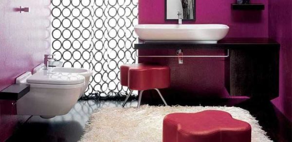
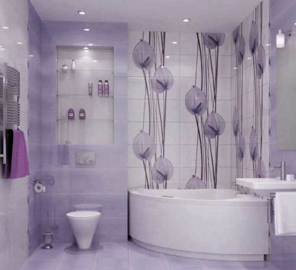
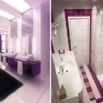
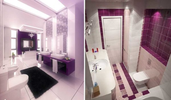
In the bathroom
In the bathroom, purple does not allow the "sterile" interior to form. Even if the room is tiled from floor to ceiling with a glossy surface. Warm shades do not add warmth and comfort, and you want to be in such a room.
-
- Purple, red and pale lilac. With mostly white and beige
-
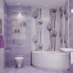
- Lilac bathroom - floral ornaments are always in trend
-
- Slightly gloomy, but young people will love it
-
- Different shades, different mood
-

- Ideas for a stylish bathroom in lilac color
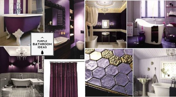
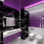
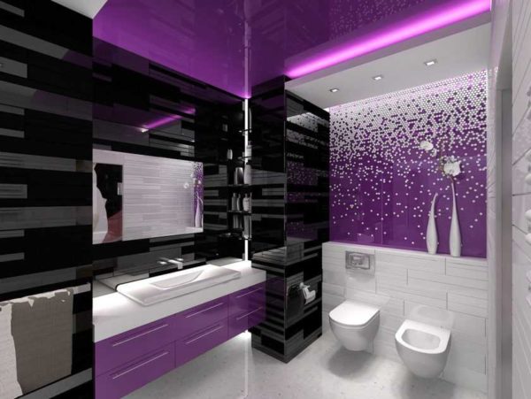
The combinations are described above: the main colors are white, beige, light shades of the same range, light gray. Accents can be set using red or small black fragments, other bright or not very compatible colors. If you want more glamor and pomp, you can add gilding, copper. Metallic details add more technocratism.
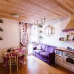
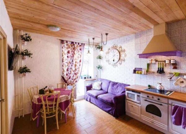
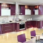
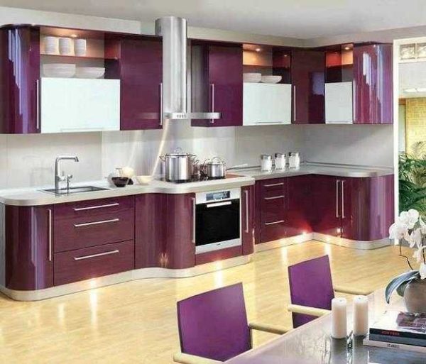
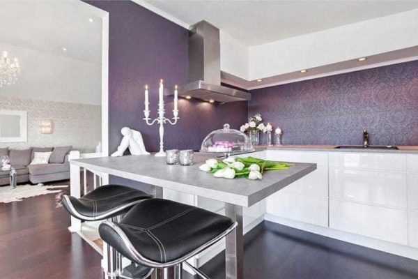
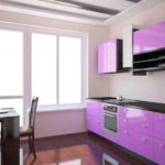
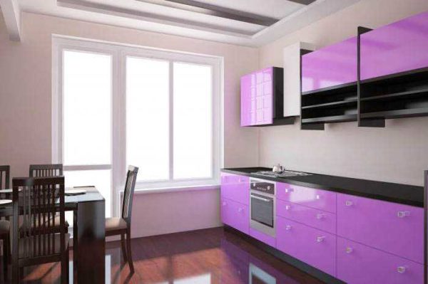
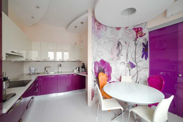
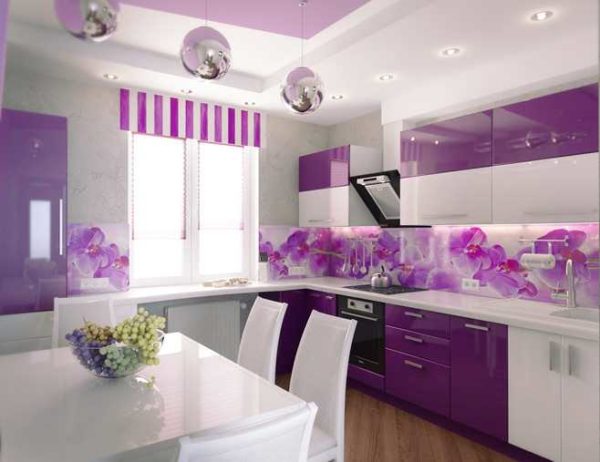
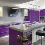
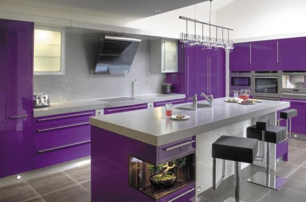
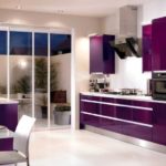
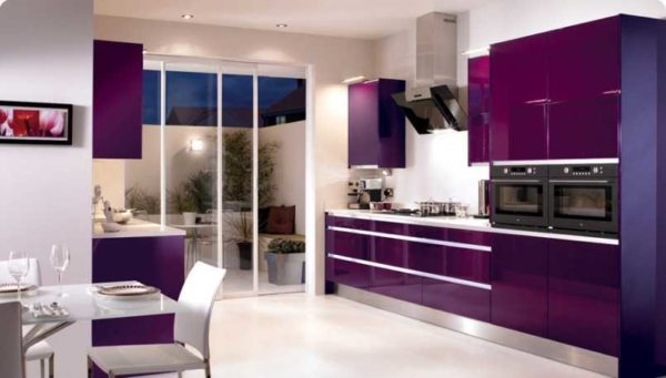
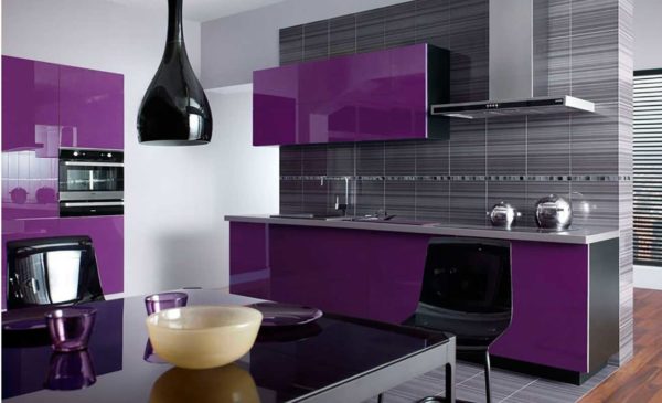
In the kitchen
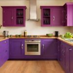
Another technical room in our apartments and houses is the kitchen. The purple color in the interior of the kitchen is not very common, although it looks modern and relevant. When using glossy facades and rich colors, it can be a high-tech style or a modern style close to it. In this case, accents are placed either in black or metallic.
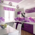
Soft lilac shades in matte facades are appropriate in Provence and classics. There are classic combinations: with white, yellow, olive. Floral designs and prints can often be seen in such interiors. They add comfort to the kitchen.
-
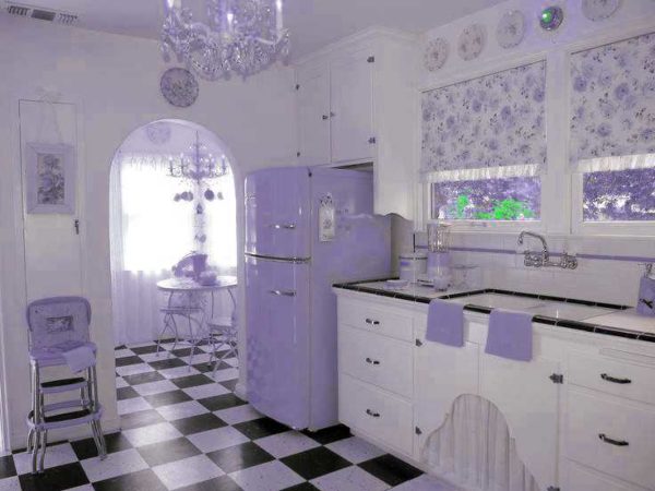
- Delicate lilac and white create a very cozy atmosphere in the kitchen
-
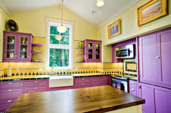
- In combination with yellow, it turns out very sunny and joyful.
-
- Two bright enough shades are balanced by the wood floor and the warm light beige of the walls

-
- Glossy facades look stylish
-
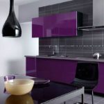
- Purple and lilac with black and white kitchen apron

-
- And here the silky texture greatly changes the perception.
-
- For a bright mood
-
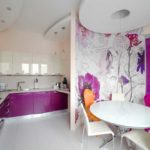
- Stylized flowers in a lilac kitchen - to create a softer interior
-
- Photos are still too heavy
-
- Many pure and beautiful shades in purple
-
- Beige and "metallic" perfectly complement
-
- With black or dark gray it turns out gloomy ...
You can use lilac and purple in the kitchen when decorating an apron or accent wall. It looks great with a panel with plant motifs. Photos overload the kitchen space, and stylized flowers look very stylish.