With what and how to combine fuchsia color in interior decoration
Room decoration is not an easy task. It is necessary to take into account a lot of information on how to choose colors, how to combine them and in what quantity, where they should be used, where not. In this article, we will talk about how to apply fuchsia color in the interior.
The content of the article
What is fuchsia color and how is it used in the interior
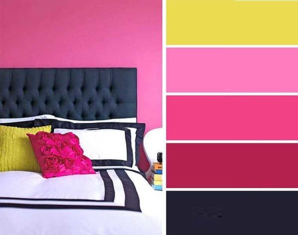
One of the shades of hot pink is called fuchsia. Intense pink with a slight purple hue. His verbal description looks something like this, but the color is best seen in the photo.

It looks like the color "fuchsia"
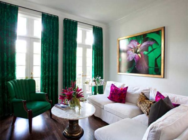
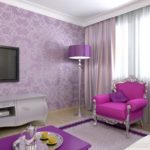
This color is very bright, intense, cheerful. Even its light shades "warm" the interior. Therefore, most often the color fuchsia in the interior is found as a companion color or one of the additional ones, but very rarely it is used as the main one. It is too bright and "active". Psychologists describe it as the color of active communication, the color of activity, and recommend using it in limited quantities. It can be used to decorate a bedroom, living room, kitchen, bathroom, nursery, hallway. But no matter how many photos you look, you will not see the fuchsia color in the interior of your office. It is incompatible with a serious and business environment. And this must be taken into account when developing your own design.
Design techniques
There are certain design tricks that take full advantage of this vibrant color. As a companion color, you can apply the following techniques:
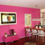
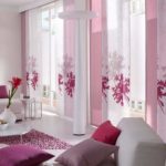
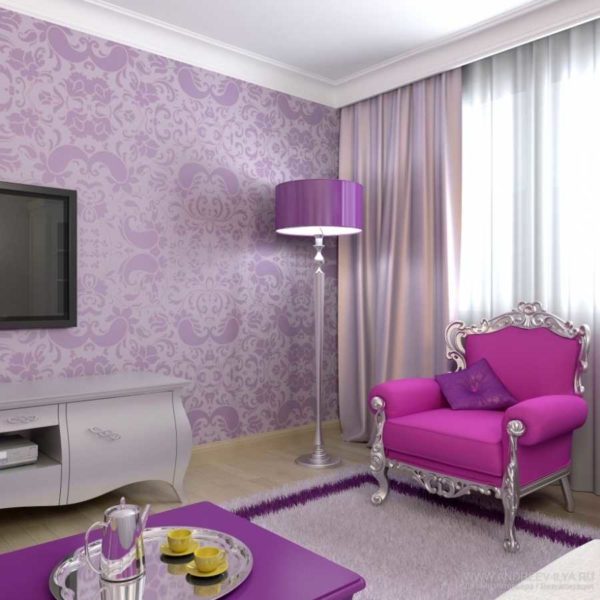
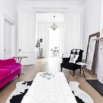
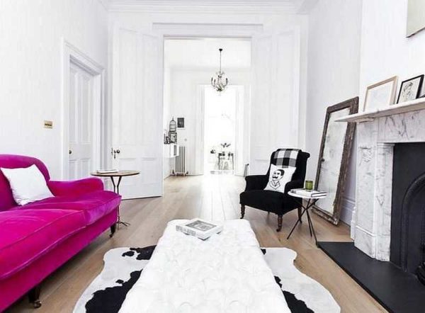
- In an interior with neutral walls, make one of the walls accent - paint it in fuchsia color. The same color is present in small quantities in small interior details. To make everything look harmonious, it is better to make the floor dark. There are also requirements for furniture: it is better if it is of simple forms, without pretentiousness.
-
- The interior is just a frame that emphasizes the merits of fuchsia
-
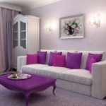
- Fuchsia color in the interior is applied dosed
-
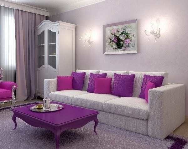
- A fuchsia accent wall in a "calm" interior is a common way to revitalize a carita
-
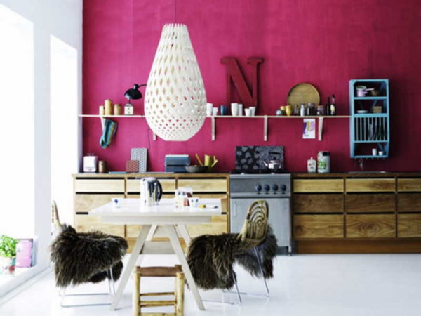
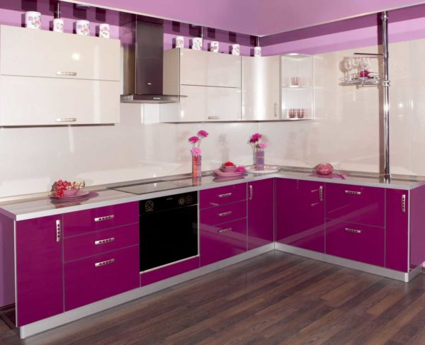
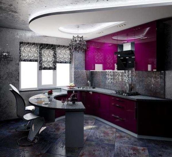
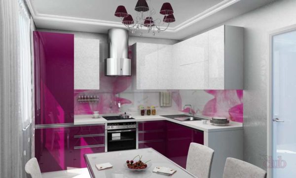
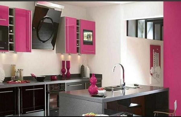
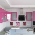
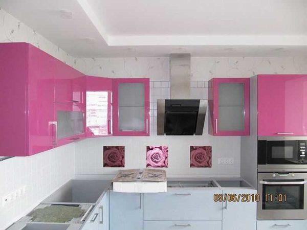
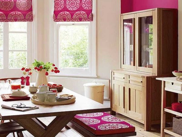
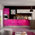
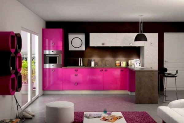
- For neutral interiors, make furniture with fuchsia facades and / or upholstery. This technique is popular when decorating a kitchen. With an overall neutral décor, bright furniture looks very good. This approach is also good when decorating a living room or bedroom. Very interesting interiors turn out. On the one hand, they are not boring and bright, on the other, they are not too overloaded with color.
-

- The bright facade of kitchen furniture is a great way to make the kitchen interior lively and warm.
-
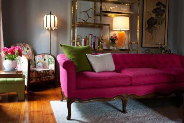
- Combined with a little green and brown fuchsia looks even better
-
- Background neutral tones serve as backdrops for vibrant and rich fuchsia
-

- All the same combinations - for a feeling of stability and comfort
-
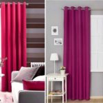
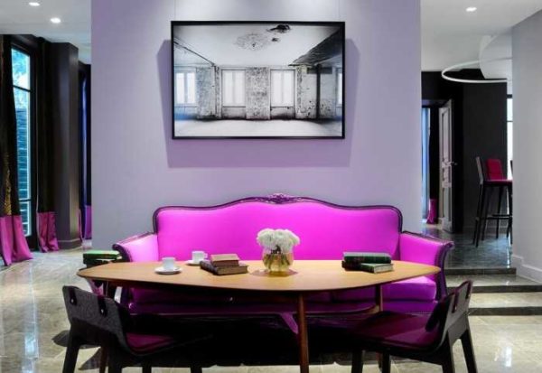
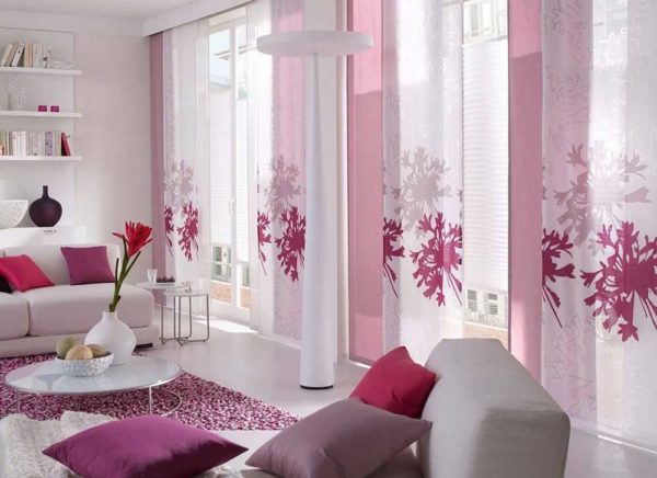
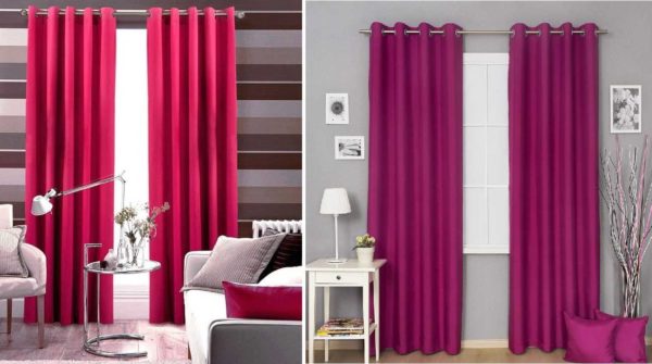
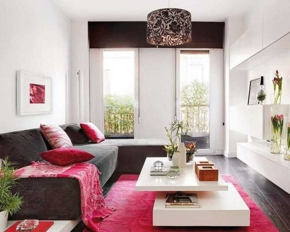
- Refresh the design in soothing colors with fuchsia textiles. A very good approach if you are not sure that you will be comfortable with such a combination of colors. Buy and hang curtains in fuchsia, the same bedspread on the bed, sew pillowcases on the sofa cushions ... All this is easy and not very expensive to do. It is also easy to then replace with textiles of a different color. If, suddenly, it turns out that you are tired of him. And by the way, don't try to find curtains with wide vertical fuchsia stripes. They are certainly stylish, but they get bored and annoying very quickly.
-
- To test fuchsia color in the interior, add a few details of this color: curtains, bedspreads, cushions, decorative elements
-

- Fuchsia curtains - in a dark shade
-
- Different shades
-
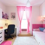
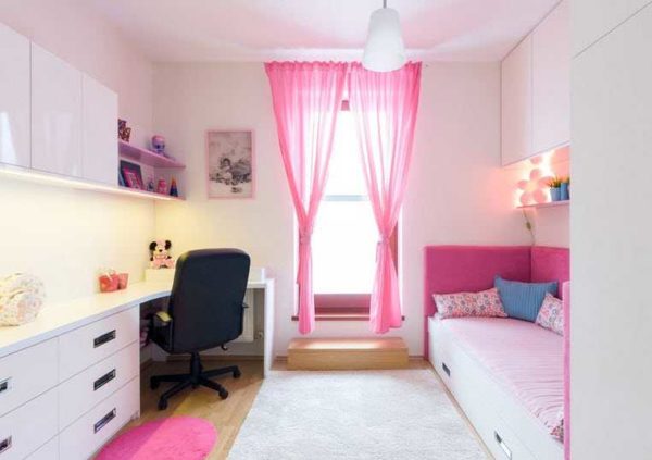
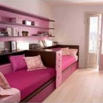
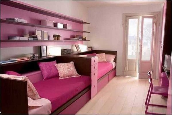
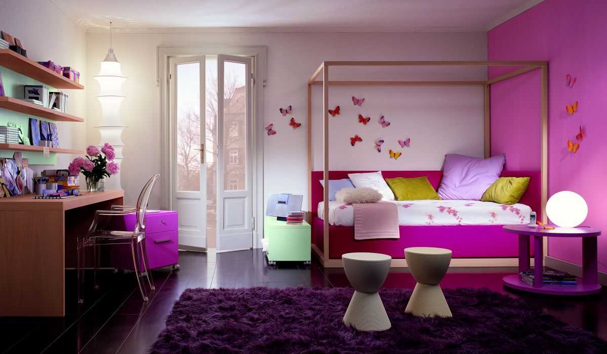
- In the light version, they are good for girls' room
-

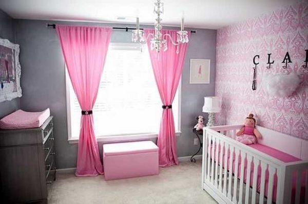
- Baby room decoration
-
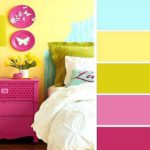
- Dilute the fuchsia in the same amount in bright yellow. Oddly enough, but two bright shades neutralize each other. Although, the interior turns out to be very "for an amateur".
-
- Oddly enough, it looks good with bright yellow
-

- Not so bright colors, but the mood remains
-

- There are very few yellow and fuchsias, but they are eye-catching
-
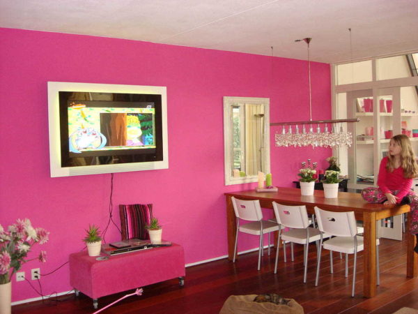
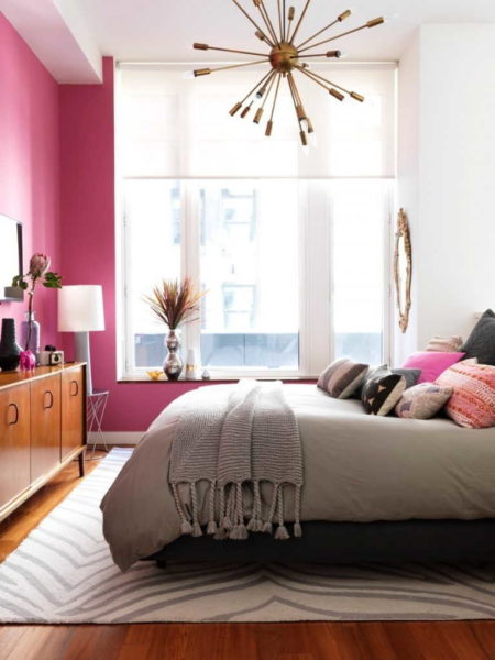

There are even more options for those cases when fuchsia in the interior is used as an additional one. It can be combined with other bright colors, but there are also interiors where the rest are complementary colors of a neutral scale. It all depends on the style in which the interior is being developed and the desires of the owners. In general, this color is considered "girlish" and feminine. Few men will agree to live in such an interior. If you are developing the design of a common room - a living room, a married bedroom - it is better to first test whether the strong half of your family can get along with a similar color. The textile trick is very good for this. If there is no objection. And everyone will be comfortable, you can paint the walls or look for wallpaper.
What bright colors does it match
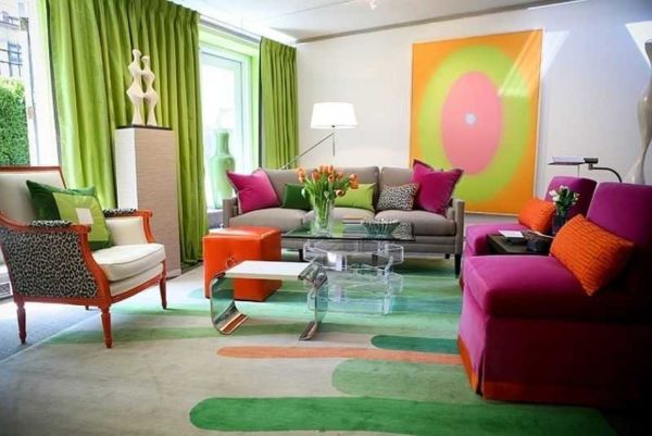
Fuchsia is one of the colors that occurs in nature, therefore it is the "natural" colors and shades that are combined with it. One of the best combinations is with green. But both colors are bright, so there may be very few of them in the interior. The main thing in such a business is not to overdo it. Even a plant can be “green”, and not just some accessories or interior details.
-

- This is the "fuchsia" flower and the most reasonable thing is to spy on the combinations from nature

-

- Darker shades of fuchsia and green give a calmer interior
-
- In this version, there is clearly more green, and the accent spots are hot pink fuchsia.
-
- The opposite approach: in this interior there is more fuchsia, and green is just an addition
-

- Such variegation is possible only in very bright, large rooms.
If you look at the fuchsia flower, which gave the name to the color, the most popular combination is just that unique shade of pink with lilac or lilac. This color combination is also used in interior design. And, as usual with bright colors, everything should be strictly metered. Otherwise, it will be impossible to relax.
-
- One of the colors - fuchsia or lilac - can be optional, the other - only in the form of accents
-

- Both lilac and hot pink in very limited quantities: only liven up the design
-

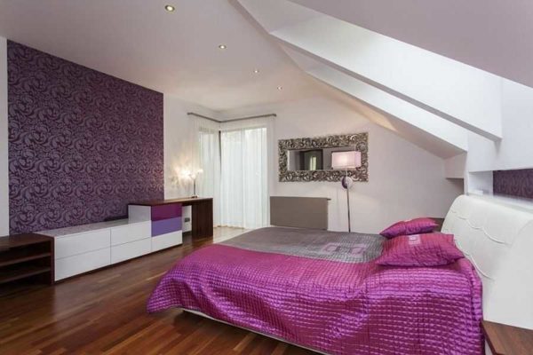
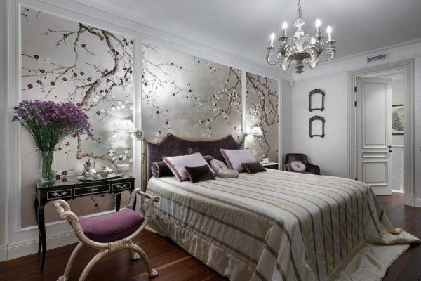
- In the bedroom, the combination of lilac and fuchsia must be used very carefully.
-
- Simple and effective
-
- Careful shade selection is essential to create the right atmosphere.
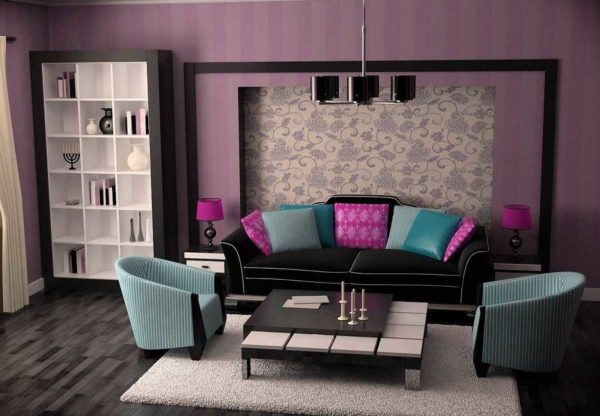
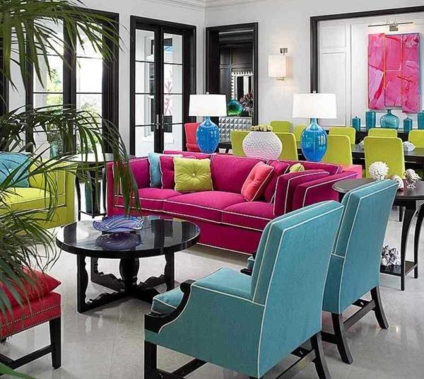
If we continue to talk about compatibility with bright colors, then we cannot ignore the combination of fuchsia and bright blue. Very impressive, lively and .. quite aggressive. So this combination is also used in small quantities.
-
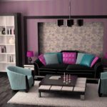
- With this combination, the rest of the interior should be very calm.
-
- The combination of three bright colors is possible but against an absolutely neutral background, with an abundance of air and light
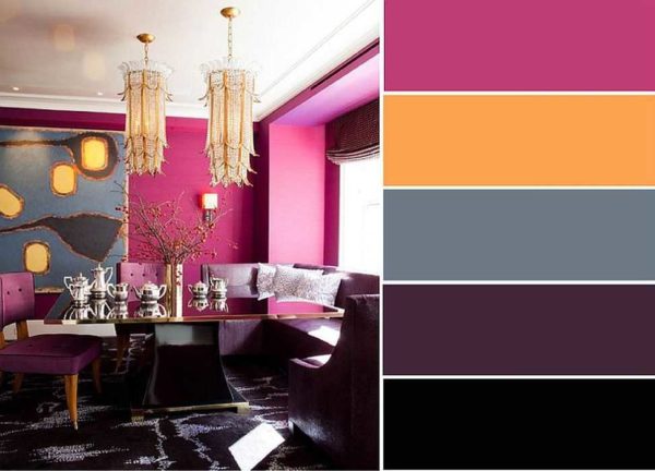
If we talk about other bright colors, then sometimes orange, mustard is added. They are added only as accents - in very small quantities. Only a few rooms - like girly rooms for the active and the bright - can withstand such combinations.
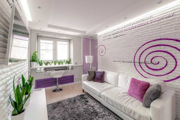
Let me give you one more piece of advice. If in addition to fuchsia in the interior you use at least one bright one, it is better to make the walls monochromatic. They can paint with water emulsion, apply a single color decorative plaster... Another option is paste over with fiberglass and then paint. This is if smooth surfaces do not appeal to you, and the plaster seems too "official". These are the techniques you see in the photo. No variegation. As a last resort, you can use wallpaper with a mild pattern, such as monochromatic silk-screen printing.
Quieter combinations
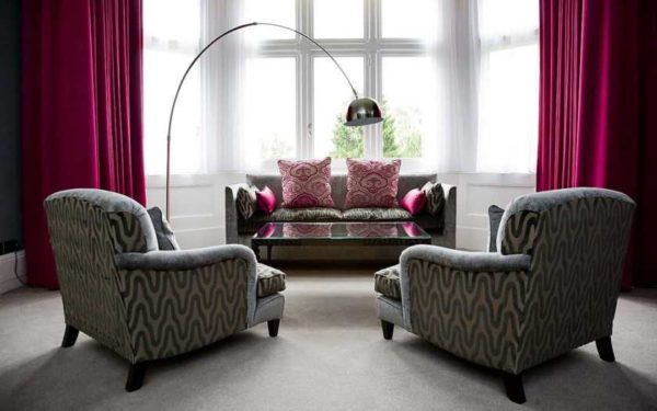
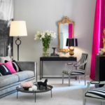
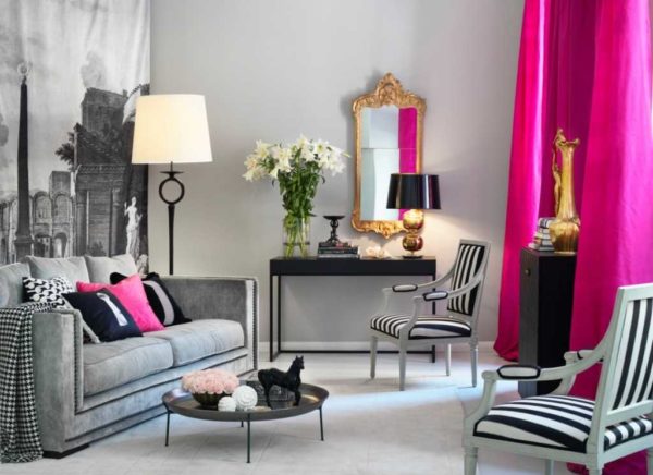
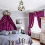
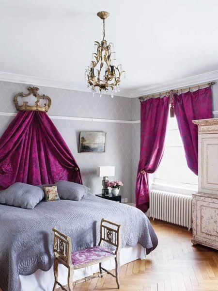
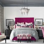
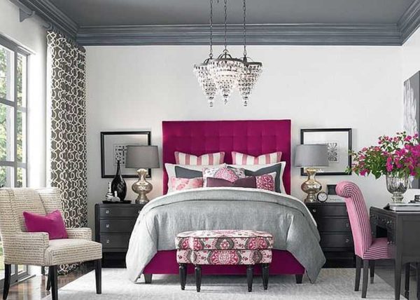
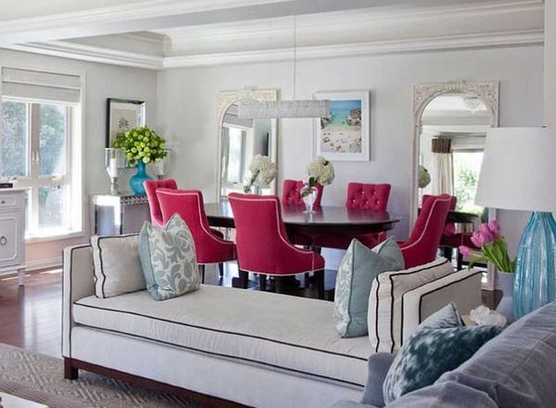
For fans of quieter combinations, there are also some very interesting options. Fuchsia looks great with gray and silver. The combination turns out to be "noble", fits into many styles. This design is suitable for almost any room: bathroom, living room, bedroom, kitchen, hallway. Everywhere, such a combination of colors creates an atmosphere of stability and comfort. Not too colorful, but not boring either.
-
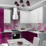
- Fuchsia color in the interior of the kitchen - combination with gray and silver
-

- In the kitchen, this combination emphasizes the style of furniture.
-
- The interior of the bedroom in silvery tones is diluted with fuchsia
-
- Lighter shades more "gentle" design
-

- Without these bright spots it will be completely boring
-
- Dark fuchsia shades are not as aggressive
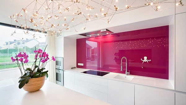
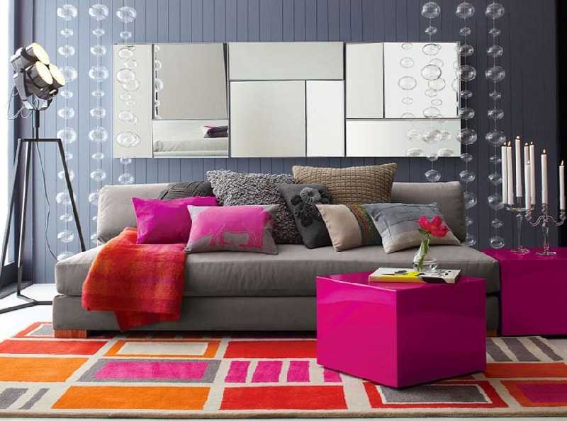
If gray and silver in combination with fuchsia seems to you, nevertheless, a little "bland", add a few details of black. It will add contrast, but not make the interior colorful. By the way, black can be “anthracite” and “wet asphalt”. All of these have an impact on perception and mood as well as the type of surface. Matte, glossy, with a silky sheen - objects with different surface types, but the same color look different. Don't forget this.
-
- If you add a little black to gray and fuchsia, the design becomes more dynamic
-
- Gray and white - as basic, fuchsia, black and brown additional and accent
-
- In the kitchen, this combination emphasizes the style of furniture.
Another option for calm color combinations for fuchsia is with brown. But light shades are rarely combined; more often you can see a chocolate or very dark shade in a company with fuchsia. In this case, one of the warm shades of white (milk, baked milk, ivory, etc.) or some light beige is chosen as the background (main) color. The general feeling of such an interior is warmth, stability, regularity.
-
- Option to combine light brown furniture with fuchsia textiles
-
- Chocolate brown is not the most popular companion, but this combination looks good
-
- Beige and brown tones, yakaya fuchsia and muted pink are the perfect combination for a girl's room
-

- Fuchsia color in the interior in brown-beige tones enlivens the picture
-

- The brightest spot is fuchsia, the addition is blue-gray
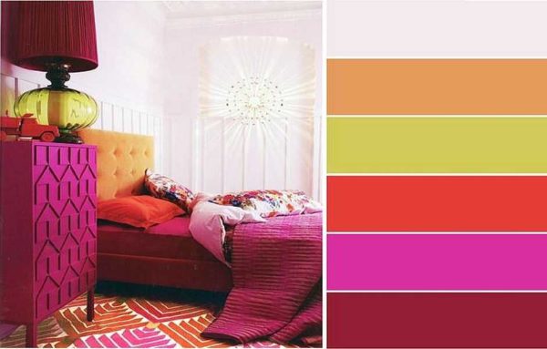
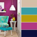
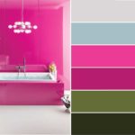
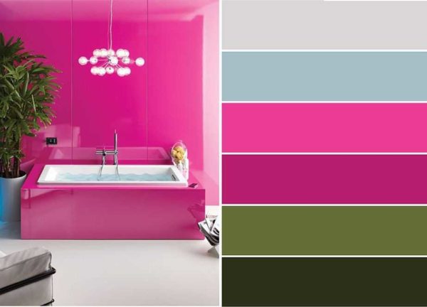
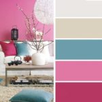
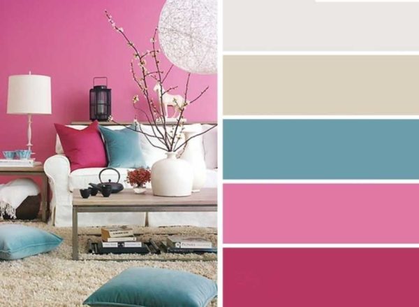
Matching charts for fuchsia
Harmonious interiors are obtained by combining colors correctly. They are selected according to the color wheel according to certain rules, but to make life easier, there are ready-made tables in which these colors have already been selected. This is much easier than guessing or making combinations according to the rules. You just need to understand how to use these tables. In the photo below, we show some ready-made color combinations for fuchsia in interiors. On the left in the photo is a table, on the right is one of the options for its embodiment in the interior.
-
- The main color is beige, one of the possible accent colors is fuchsia
-
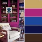
- For calm, but not boring interiors: base - beige, additional - blue and dark fuchsia, accent - black and dark brown
-
- A rare option - the main color is fuchsia
-
- Beige base again, but with other complementary colors
-
- In this combination, fuchsia is only accents
-
- Basic color - gray with bright additions
-
- For a more delicate interior in pastel shades
-
- Bright combination option
In the presented tables, five colors are selected. The first is basic. There is a lot of it, it is the main one. The next two are optional. There are also a lot of them, but much less than the "base". And the last two are accents. In such colors, color spots are made. There may be very few of them.
As you can see, in most cases, fuchsia is used in the interior as an "accent". And this is justified: it is too bright. When there is a lot of it, it gets tired. If you liked a certain color combination, but are not satisfied with, say, the base color, you can either use a lighter shade of the same color, or choose another one, which is in this table, as a "base". If none of them suits you as the main one, you can take white or light gray. Also, within the same table, you can swap additional and accent colors, you can use lighter or darker shades.
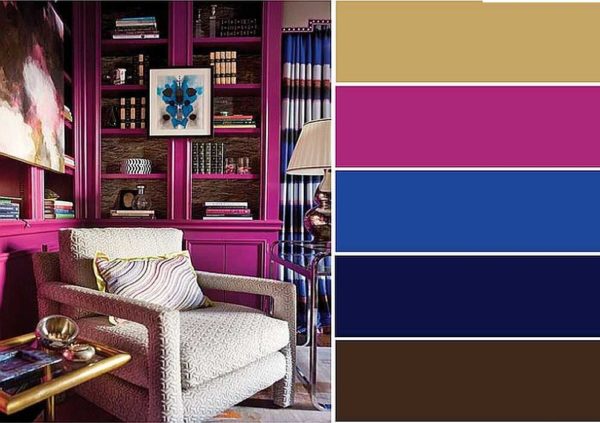
Fuchsia color in the interior: photo
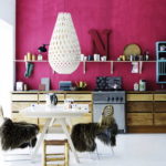
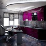
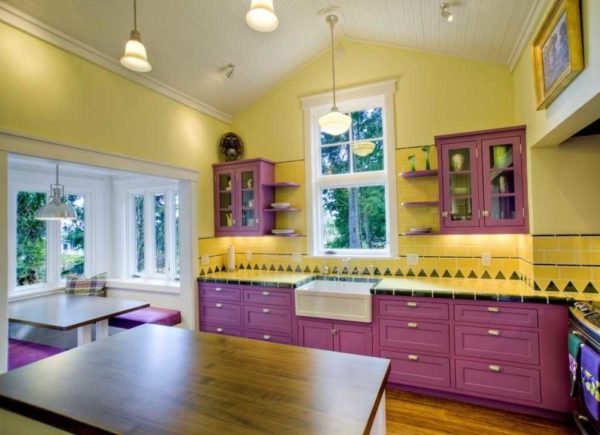
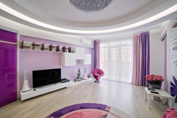
Kitchens in a modern style are "friendly" with fuchsia
In art deco, bright spots are a ding of style signs
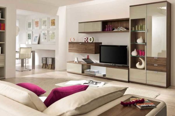
Combined living room and living room - all colors taken into account
Contemporary style - a combination of neutral and vibrant colors
Interior for a girl with "fuchsia" as an additional
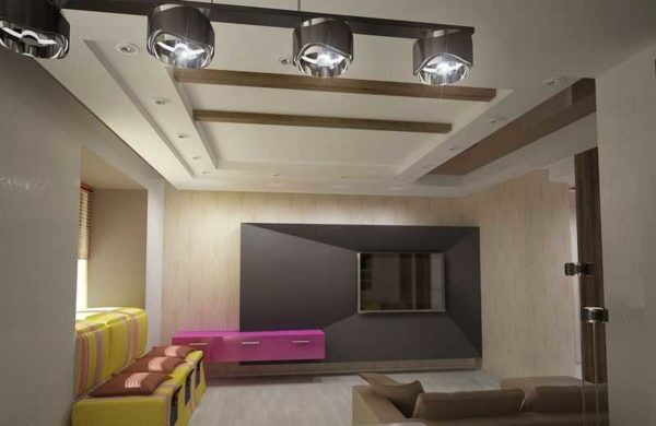
Colored panels - a highlight of the interior
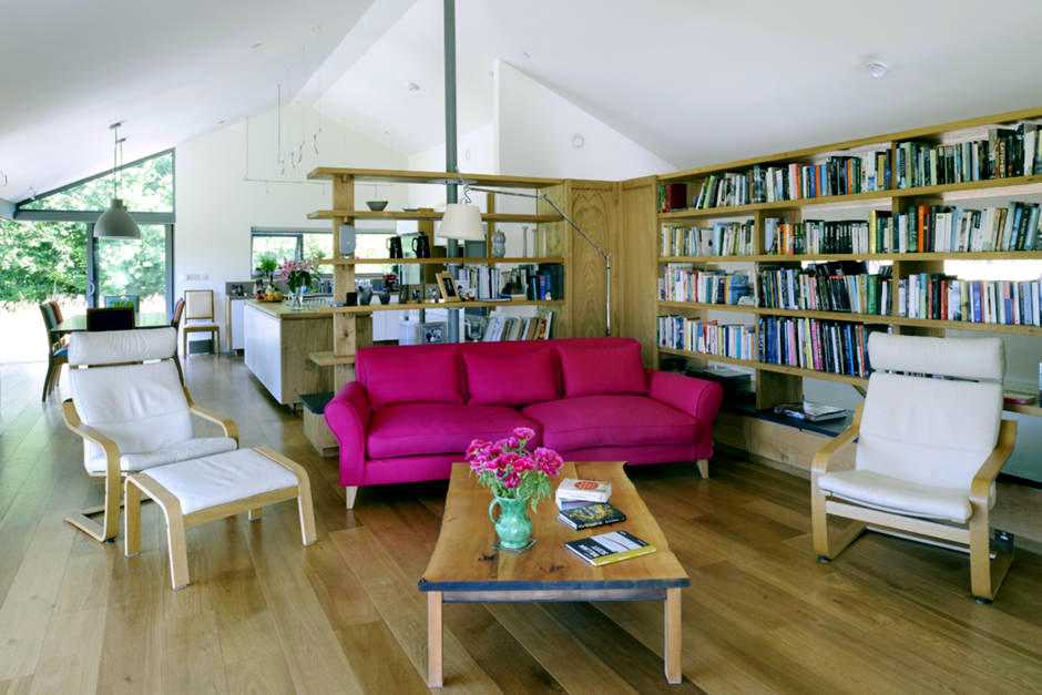
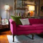
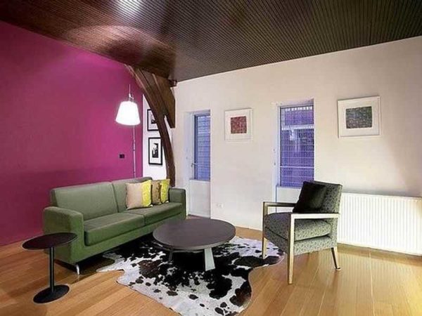
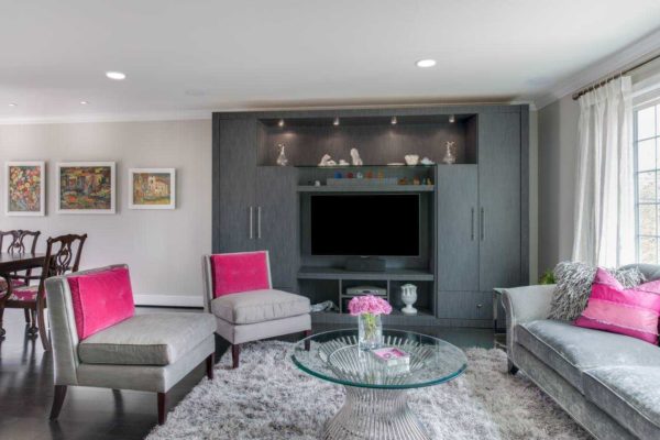
Just a bright sofa
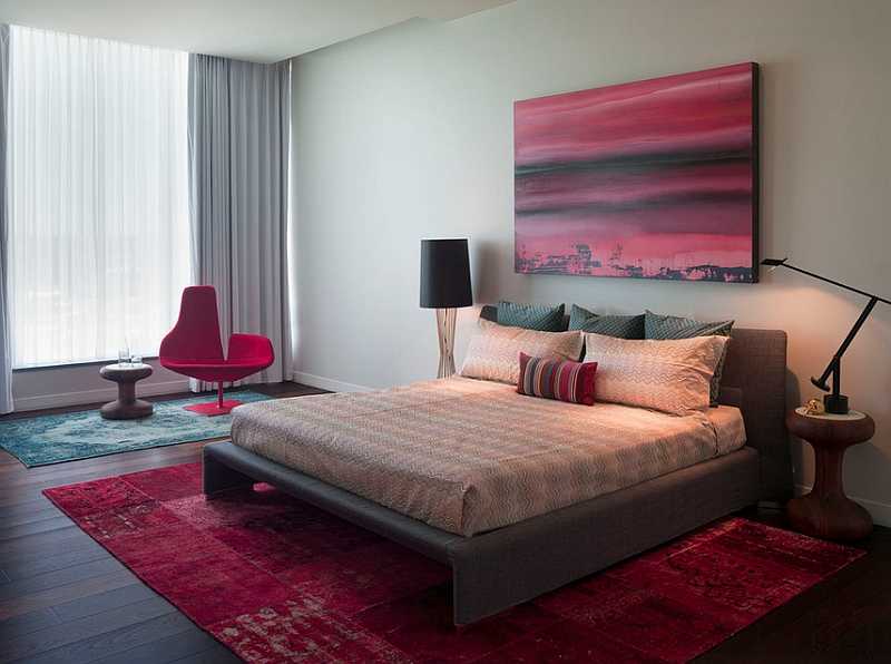
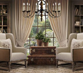
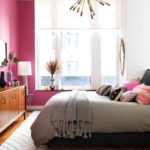
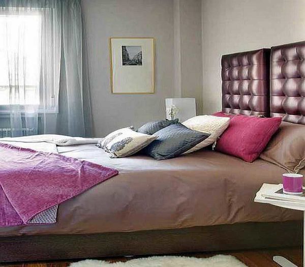
It is better to use muted shades in the bedroom.
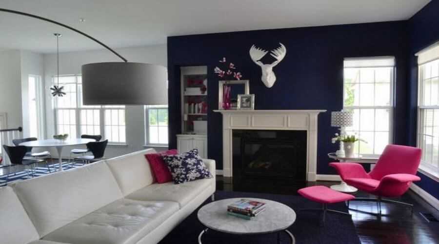
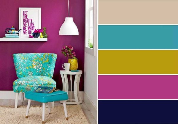
Intense cobalt blue, almost black, is the perfect backdrop for a fuchsia armchair
Light interior in natural colors