Color combinations in the interior
The effect of colors on humans is a scientifically proven fact. In order to live comfortably, you need to choose the right combination of colors in the interior. It's not so easy. There are special rules that must be followed in order for the colors to be compatible. There are also ready-made tables to make the whole process easier.
The content of the article
Principles and types of formation of matching colors
In nature, there are a huge number of shades of colors. But, as you may have noticed, not all of them look equally good next to each other. Some seemingly unexpected combinations are simply mesmerizing, others would rather look away. This is because when choosing flowers for the interior, flower beds, bouquet, clothes, one must be guided by certain rules and principles.
The palette of matching colors can be from two to seven colors and shades
To make them easier to remember, we created special tools - a color wheel and tables of matching colors. Basically, the main tool is a circle, and tables are a ready-made selection result for it. If you want to learn the basics of combining colors, use the wheel. Otherwise, select the option from the tables.
The color wheel and rules for its use
The color wheel has three levels. The main colors are contained inside - red, blue, yellow. They are called primary. Their pairwise combination gives three additional (secondary) colors - purple, orange, green. At the third level, tertiary colors are placed - this is the result of a combination of secondary and primary. Based on these colors, the combination of colors in the interior (and not only) is selected.
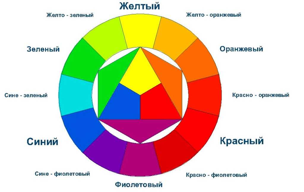
Color matching circle - for the selection of basic colors for the interior
As you can see, black, gray and white are not represented in the circle. They do not exist in their pure form in nature; in interior decoration they can be used as basic (white and gray) or additional ones.
Number of colors
Before explaining the rules for using the color wheel, you need to figure out the number of colors for their harmonious combination. In general, you can use two, three or four matching shades. You can also add universal ones to them - white, gray, black. This is exactly what decorators and artists do.
There are many colors, but in one interior they look harmonious. This is because they are selected correctly - they are combined with each other
But for the interior, two shades are too monotonous and boring. Much more interesting are rooms decorated with a combination of three, four or more colors. However, it is wrong to use colors in equal proportions. One or two of them are chosen as the main ones, there are “many” of them. Walls and floors are painted in these colors, they are present in furniture upholstery and textiles. Another one or two are used as additional ones. There are not many of them, but they are noticeable. The rest - no matter how many there are - serve to introduce variety and accents. They are present in small quantities - these are decor details, pillows, etc. If you take a closer look at the interiors that you like, most likely you will find this pattern of color distribution.
The combination of colors in the interior based on the color wheel
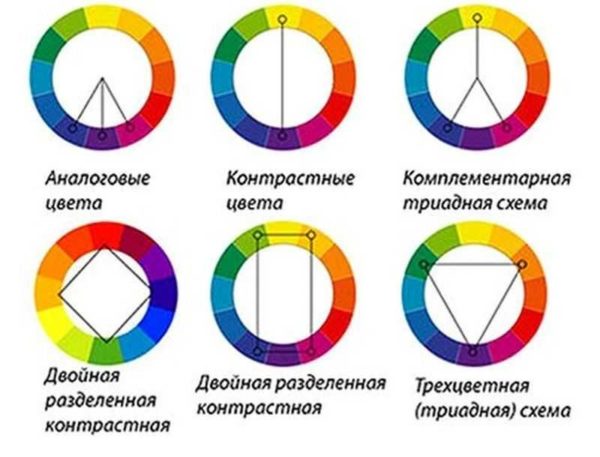
Using the color wheel, you can choose the matching colors from it. They do this according to certain rules. There are several principles for forming combinations:
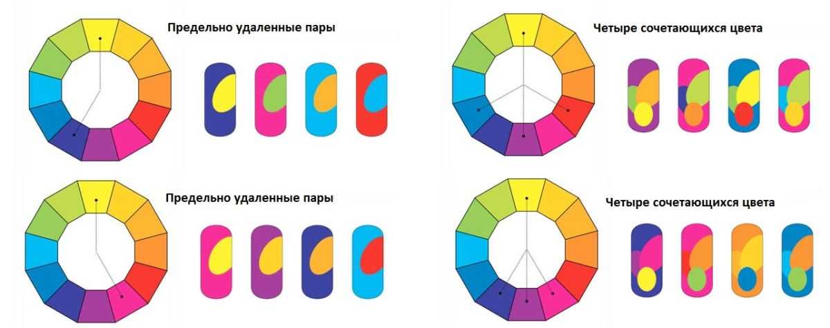
- An analog triad is several shades located one at the will of the other. So you can choose two to four shades.
- Contrasting colors are two colors opposite one another. They look good together.
The principle of forming harmonious color combinations
- Complimentary triad. Instead of one of the contrasting colors, two adjacent to it on both sides are taken.
- Dual split contrast color registration scheme. It is formed in two ways: by the inscribed square - every third color in the circle is taken, or by the inscribed rectangle - the lower two colors are complementary (after one) and also contrasting ones selected for them.
- Three-color (triad) scheme. They choose a base color, two additional ones to it - after three shades from the base one.

Several dozen combinations can be formed based on these principles alone. But there are still extremely distant pairs and four colors that can be combined. This adds more options.
Additional principles for the formation of groups of combined colors
But that's not all. Each of the colors in the circle changes in saturation - from lighter in the middle to darker outside. That is, in the selected sector, you can pick up several shades by tone. This combination of colors in the interior is called monochrome. They are also used in design.
Within the same color, you can take several shades, add touches of neutral colors - that's the monochrome interior is ready.
Playing with color is sometimes interesting. And in order not to be too boring, you can use "universal" accents - black, white, gray or red - to taste, depending on the desired mood and the purpose of the room.
Tables of color combinations in the interior
It may be interesting to choose the combination of colors in the interior yourself, but unknowingly you can make mistakes. For simplicity, tables have been created that simplify the creation of the interior. Especially if you know how to use them.
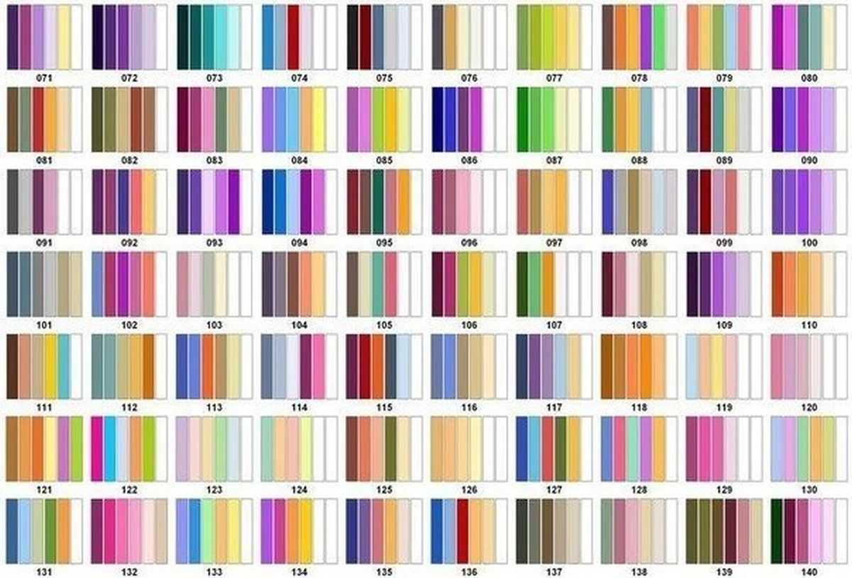
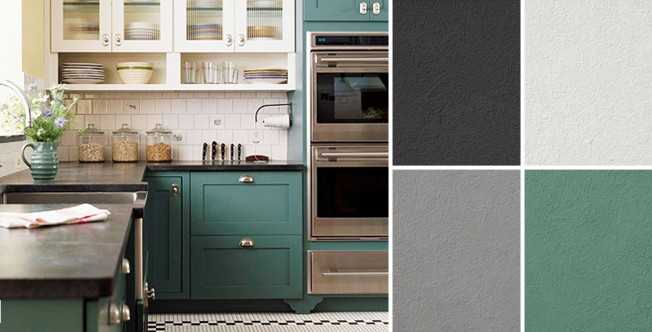
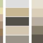
Color combination table in the interior - several options
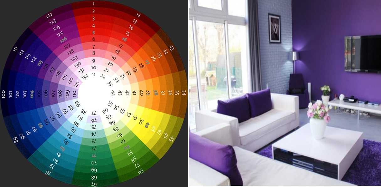
In the color tables, the combination of colors in the interior is given in the amount of five to six shades. They must be used keeping in mind the rule. The first shade is the main color, the second and third are complementary, the rest are accent. That's how you distribute the colors.
In such tables, look for the shade in the first position that you want to make the dominant one. Having tried, you can find three or more options. After all, there are tables that are compiled in contrast, complimentary, etc. principles. So there are a lot of options. For example, in the above piece of tables (in fact, there are very, very many such sheets) for bright blue, there are two combinations: 127 and 135. On other sheets there will be even more of them. From the options found, choose the combination of colors in the interior that appeals to you more.

Tables of harmonious color combinations in the interior can be presented as follows
There are tables that have a different look: they have a dominant shade perpendicular to the complementary and accent. The rules for using tables of matching colors do not change from this. Only the main color is highlighted, making it a little easier to navigate.
Photo examples of interiors indicating the color combination used
The fact that colors affect mood and well-being has been talked about for a long time. There is even such a direction of non-traditional medicine as color therapy, where various kinds of disorders are treated by being in the interior with a predominance of a certain shade. So the "mood" of each color should be kept in mind when choosing a palette.

Human exposure to color based
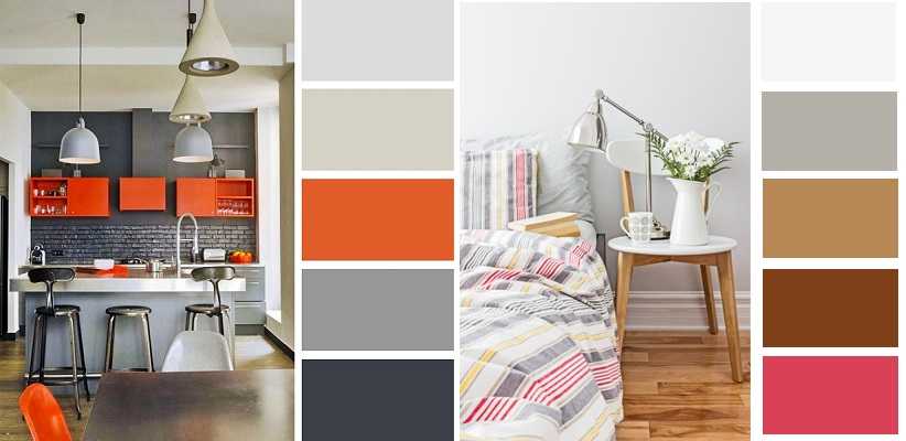
Red: matching colors
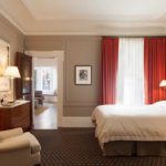
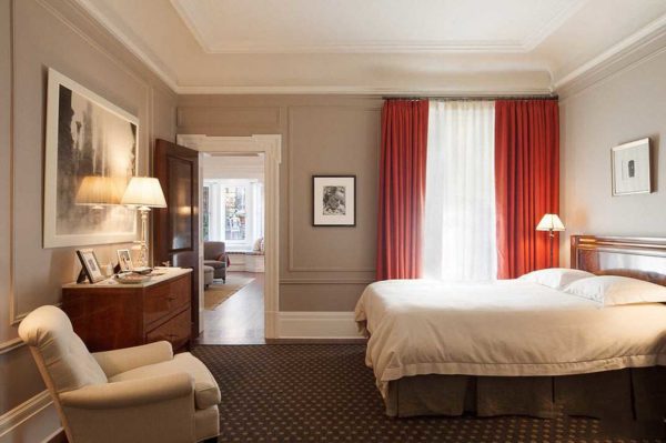
Red is a very active and aggressive color. Usually it is present in interiors as accents - to break the monotony of design in white, gray or beige. In this case, it is practically irreplaceable - it animates the picture very well. You can see for yourself - below are a few photos. Red in the interior of the living room only in this version, and maybe, otherwise the inhabitants' anxiety increases, health problems may even begin.
-
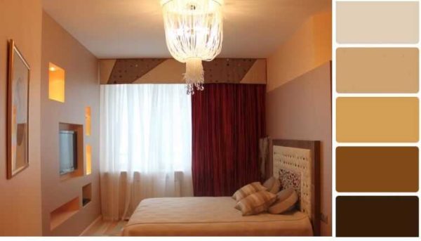
- In the interior of a red bedroom, there may be some textiles, several decorative details.
-
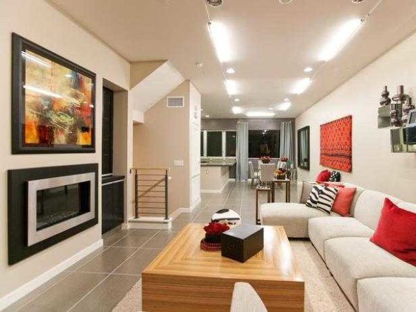
- The main one in this interior is milky white, the additional one is brown and beige, accents are green and red.
-

- Roughly the same range, but for a living room in a different style - here instead of green, black details, which gives more "coldness" to the atmosphere
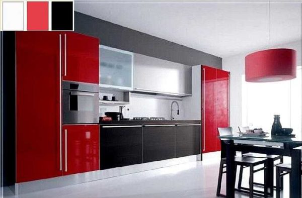
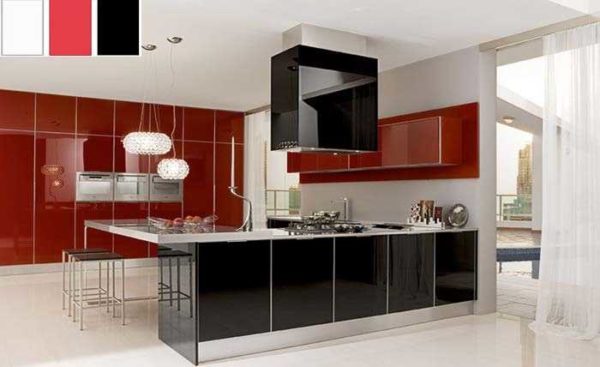
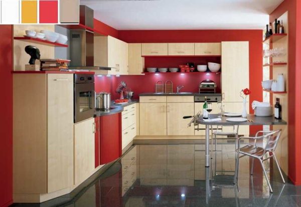
The place where red can be the dominant color is the kitchen. Here you need high activity and this color will give you vigor. And, at the same time, it will also increase your appetite.
-
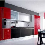
- Even in the kitchen, red is present as an accompanying, but not main
-
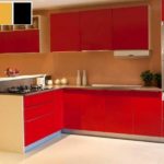
- Facades in modern kitchen sets can be of different colors.
-

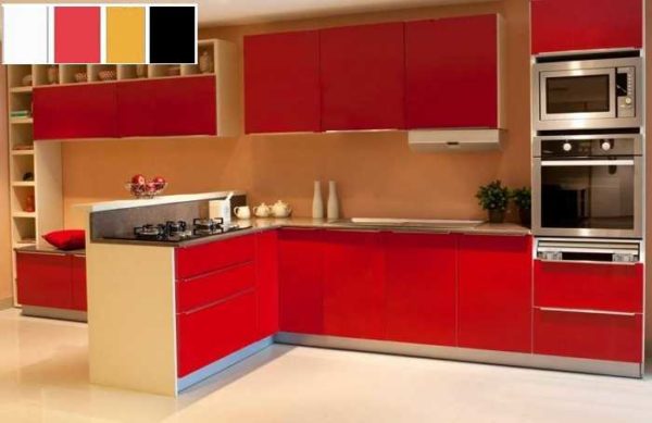
- Add beige for a softer interior.
-
- Red does not look so defiant with beige
If you need a similar effect, please choose a combination of red as the main one. Gray goes with it, shades of white, beige, black details can be found. You can also find a little green - in the form of plants or several details. Other colors are rarely intertwined, otherwise it turns out to be too colorful even for the kitchen.
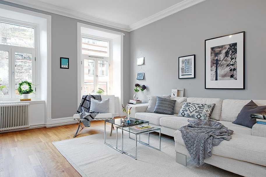
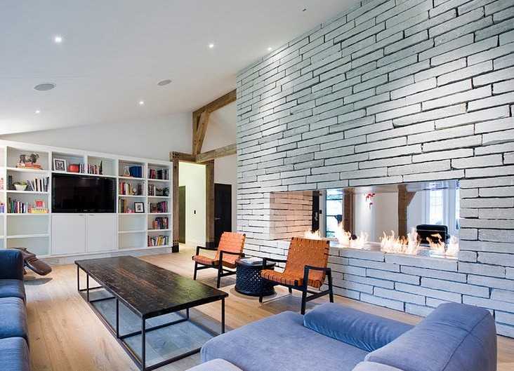
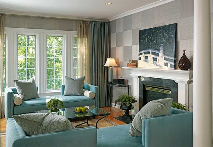
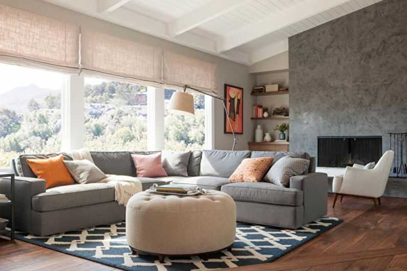
Combination with gray
Gray is a dull, so-called base color, with which any others are combined. For the interiors of living rooms, this is one of the best options. There are several ways to create the right color combination in a gray-dominated interior. They take two or three shades from the gray scale, add one or two shades of a different color, and a very harmonious design is obtained.
Combine gray with other colors to create a harmonious interior
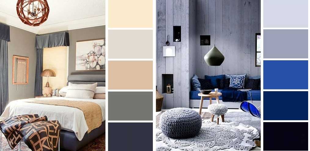
In the photo above, the bedroom interior is formed according to this principle. Light gray in them is the main one, two more saturated shades are additional. In one case, blue (complementary shades) are used as accents, in the other - pastel pink.
By the way, brown looks good with gray, and if you add warm shades of raspberry, yellow, orange as an accent to them, you get a very cozy and "warm" interior, which is suitable for a bedroom, a girl's room, and is applicable to kitchen design.
More options for matching colors with gray
Gray in the kitchen also looks very good. It is suitable for creating interiors in loft, hi-tech, modern style. In this room, everything can be even simpler: add one bright one to three or four shades of gray - yellow, red, orange, blue, green. In one of the bright and warm colors. It turns out a very unusual and not at all dull combination.
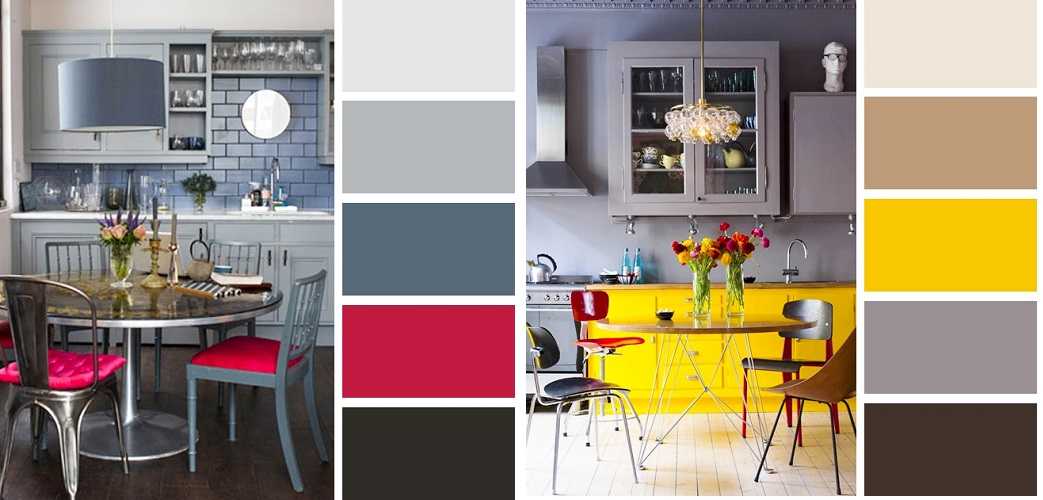
Crimson and yellow as accents - create a mood
In general, interiors in gray - with any accents - turn out to be somewhat chilly. This is not bad for a kitchen, especially if it faces south. Such combinations are also good in the corridor / hallway. In those interiors where there are at least two warm shades with gray, and the interior turns out to be warmer, it is quite suitable for bedrooms, living rooms.
Beige and matching colors
Beige is an even more versatile color in the interior. Like everyone else, it has warm and cold shades, but in any case, it creates an atmosphere of comfort and reliability. You can create a monochrome interior based on beige colors. This option is for lovers of discreet interiors. This combination of colors in the interior is typical for the classics.
Beige with brown additional - comfort and tranquility
If you need solidity, add brown, any color spots are suitable for more lightness - as is the case with gray. Add cold shades of color spots to cold shades of beige, and warm shades to warm ones.
-
- In the bedroom, beige and brown creates a sense of stability
-
- For accents, add one or two bright or pastel colored spots, depending on the effect you want to create
-

- Several color combinations based on beige shades with added color accents
-
- Characteristic ranges for calm, neutral interiors

Beige can be chosen as the main one. The walls and the floor are then painted in it - in lighter shades. Furniture is chosen darker, but also beige or brown. Add a few accents of vibrant colors.That's all, a harmonious interior is ready.
Match colors to furniture
Often, when choosing colors for the interior, they are tied to existing furniture. For such cases, there is also a table of compatible shades. It is not difficult to work with it: in the right column, choose the color of the furniture, in the middle column, friendly colors are written, in the extreme left, those that are incompatible.
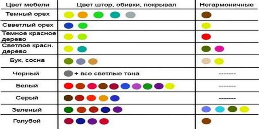
How to match colors to existing furniture
But don't use every possible color. In addition to the color of the furniture, there may be three to five more colors. In this case, the basic ones - white, gray, black - are also considered. So don't overdo it.


Hello, how to choose the right color for the countertop. If the white facade of the kitchen and light beige floor tiles
Hello. With such a basic one - white and light beige - you can choose any color. In the classic version, choose the same white, beige (as on the floor) or black. If you want to revive the picture, the tabletop can be of any color. Literally anyone. The colors you describe work with everyone. Just keep in mind that to maintain the color of the countertop, you will need other details of the same color in the interior. As an example, one of the walls painted in the same color (not an apron), dining furniture with covers of the same color, curtains on the window, etc. The exact solution depends on the style. In the classic interior, the same white and beige will go more. If the facade is in a modern style, black or colored ones are better. »Alt =» »/>
Good day! What color should the furniture be in gray wallpaper (two gray light and dark)
Good day! In principle, any color goes with gray wallpaper. Depends on the purpose of the room, size, amount of light, floor color, etc. White furniture or very light gray. This is a win-win. BUT such facelessness can be tiresome. You can add colors - bright armchairs, sofa, curtains. Several ideas in the photo. Maybe it will help you.
Hello! Please tell me what color to choose a sofa and what color will suit the wallpaper in the living room, if the color of the ceiling is ripe cherry, the color of the furniture is beech, the color of the floor is something like furniture. At the moment, the wallpaper is soft pink and a beige sofa, which is not in the subject, does not look at all with furniture. I will be very grateful for the answer.